A journey through letters
Typefaces
Typography has always fascinated me. Studying at HS Düsseldorf (HSD), a school known for its strong type design program, shaped the way I see and use fonts. The attention to detail, the way small adjustments can change an entire feeling—these things stuck with me. Even though I never pursued type design professionally, it became an essential creative outlet.
For years, my typeface ideas lived in notebooks. But once I started digitalizing them with Glyphs App, I could finally bring them to life. My fonts are sans-serifs, and while much of type design is about optical balance, I approach it tactically and mathematically—analyzing structure, spacing, and form in a precise way.
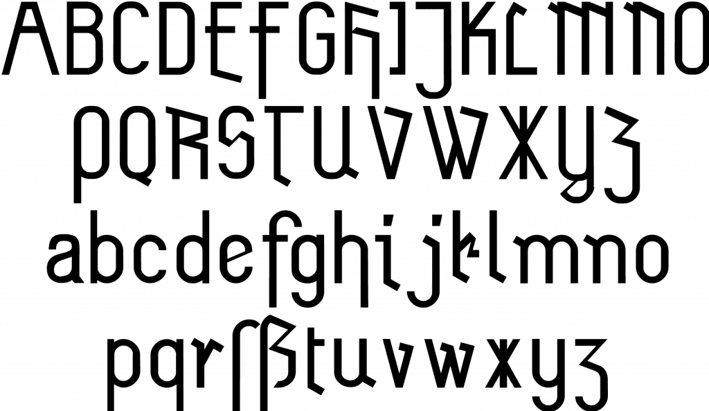
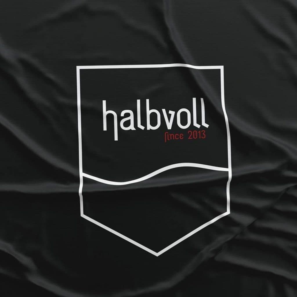
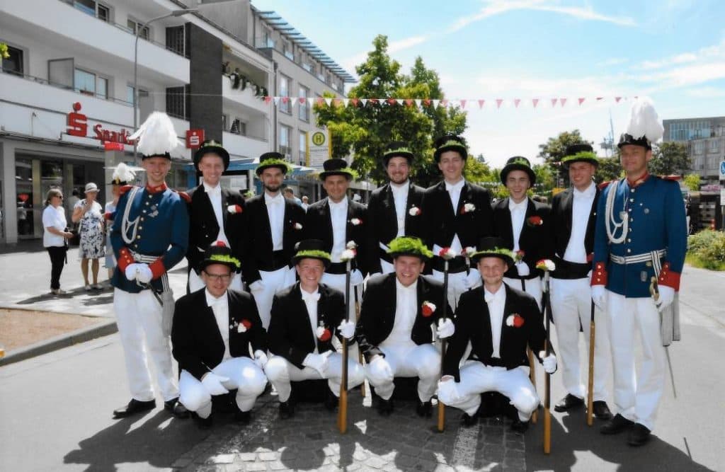
Zeche – Inspired by Zeche Zollverein and my move from NRW to Berlin, this font reinterprets old German industrial typography in a modern sans-serif style. Today, it’s in use by a traditional Schützen club Halbvoll, leaving a piece of myself in my hometown.
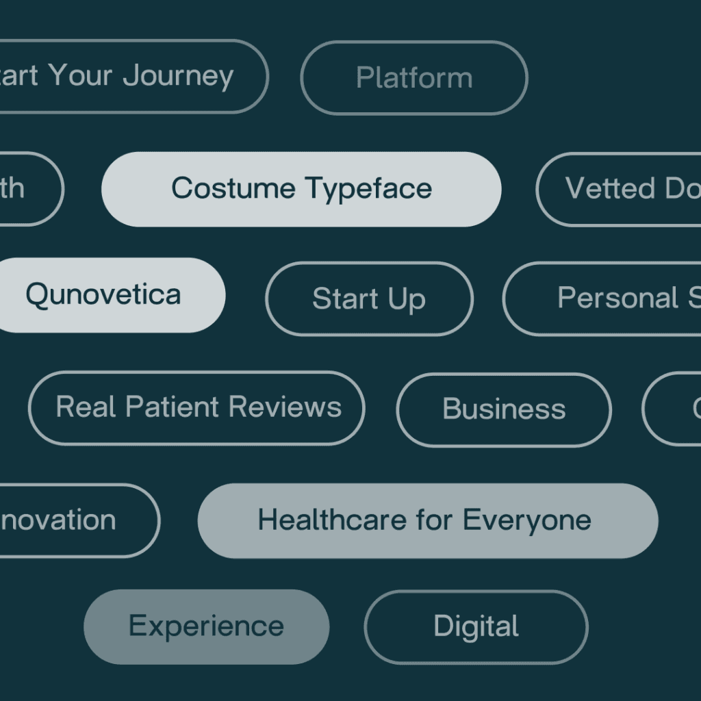
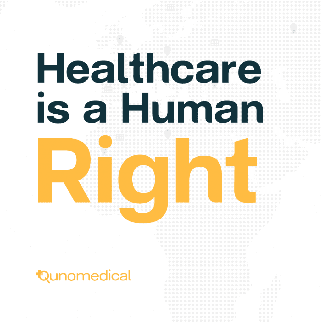
Qunovetica – Created for Qunomedical, this typeface blends Helvetica’s clarity with Qunomedical’s brand personality, ensuring a consistent yet warm brand experience. It was a challenge in balancing identity with functionality.
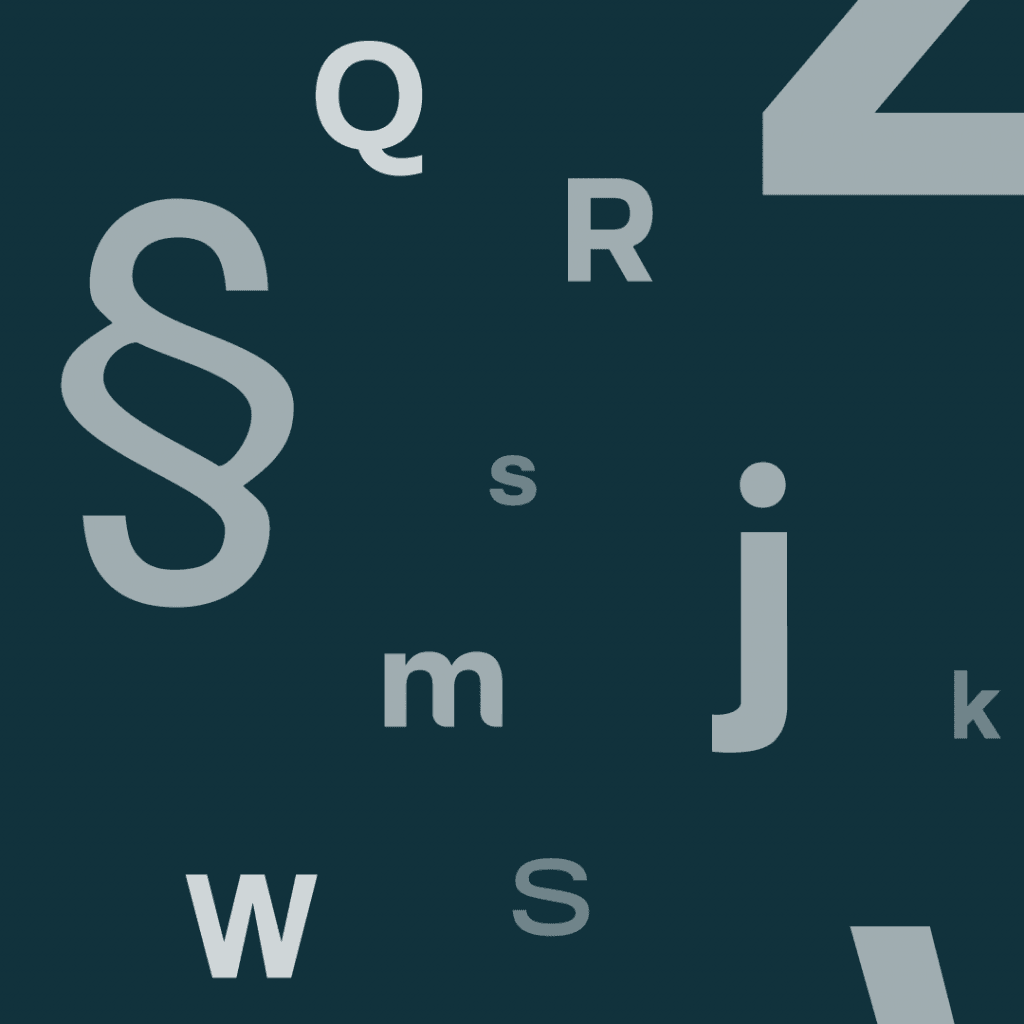
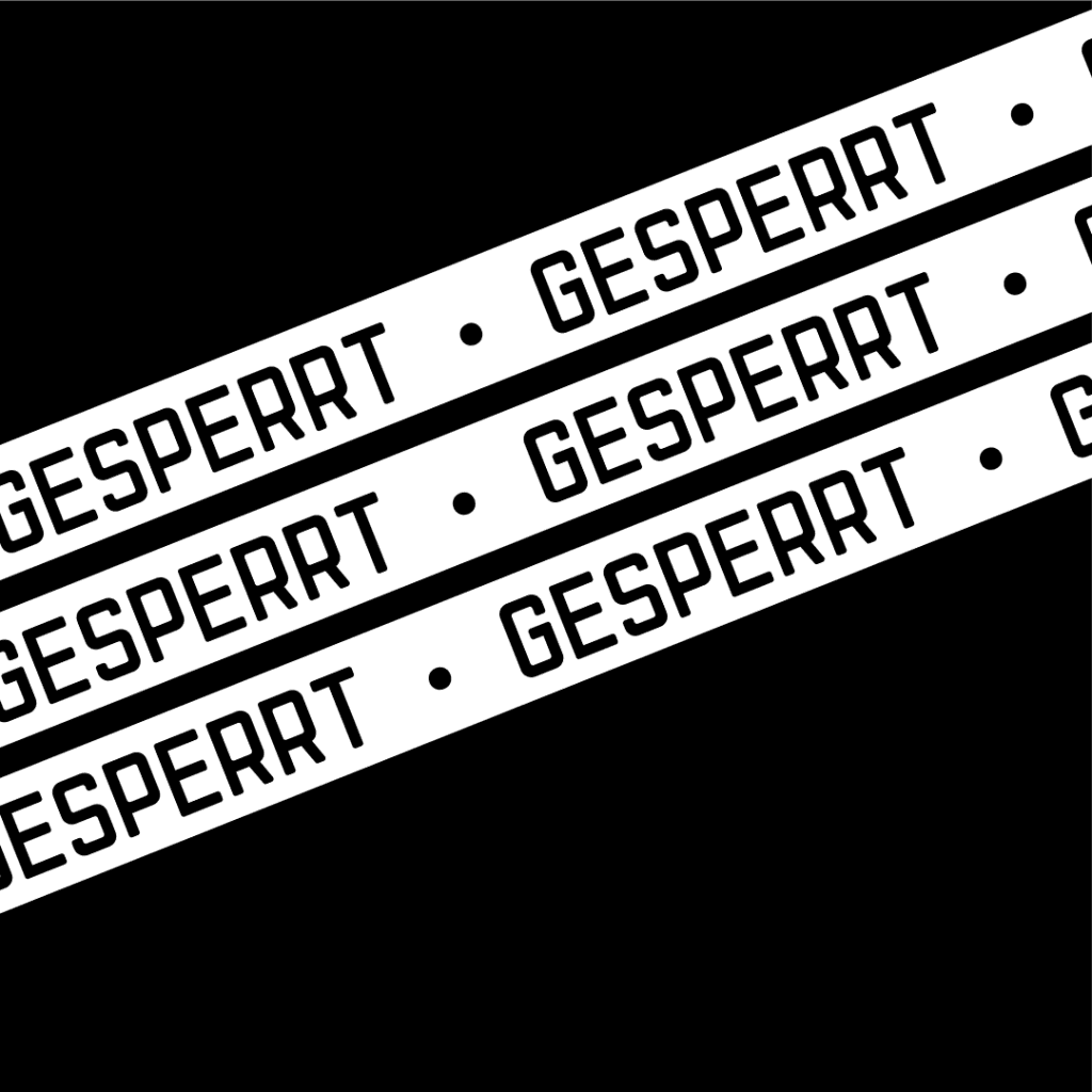
West – A structured font, inspired by Berlin’s historical border signage, marking the transition from West to East. This project was a personal exercise in regaining structure—a way to rebuild focus after struggling with long COVID and leaving East Berlin to recover.
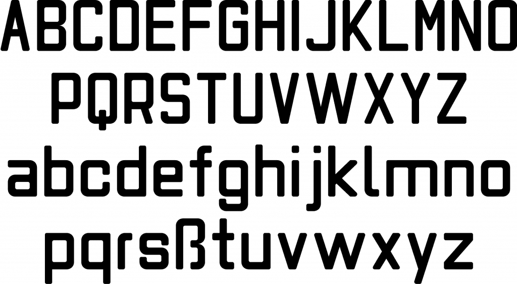
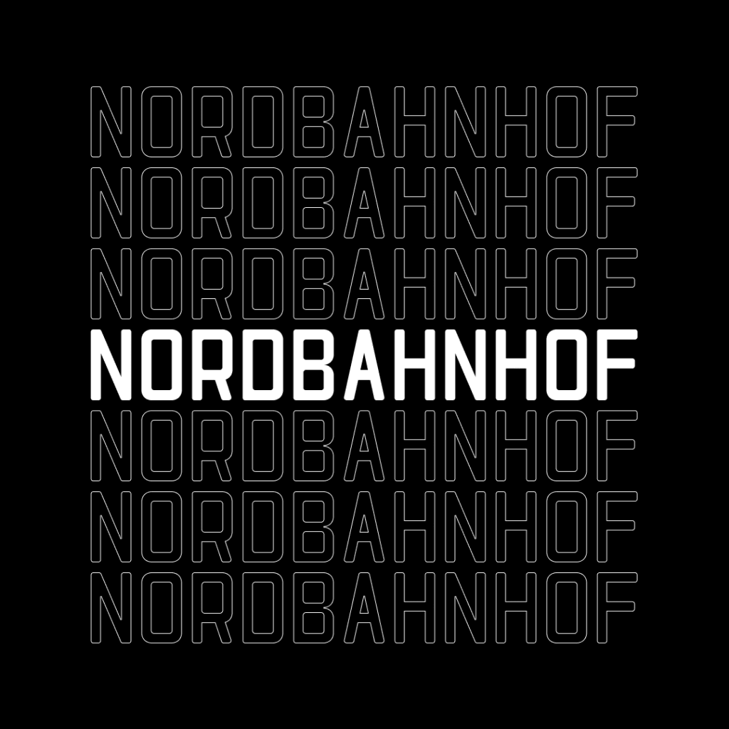
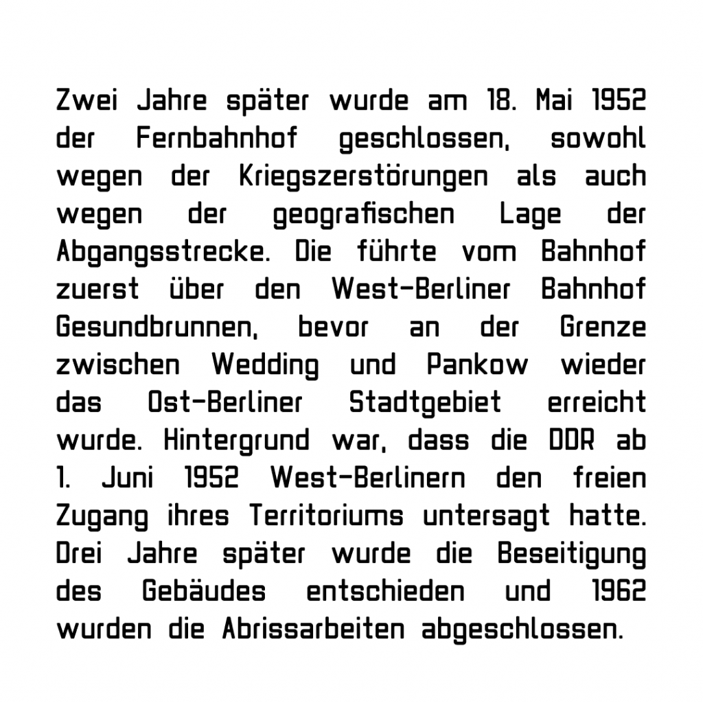
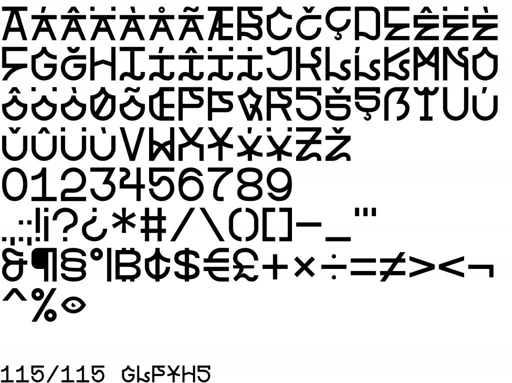
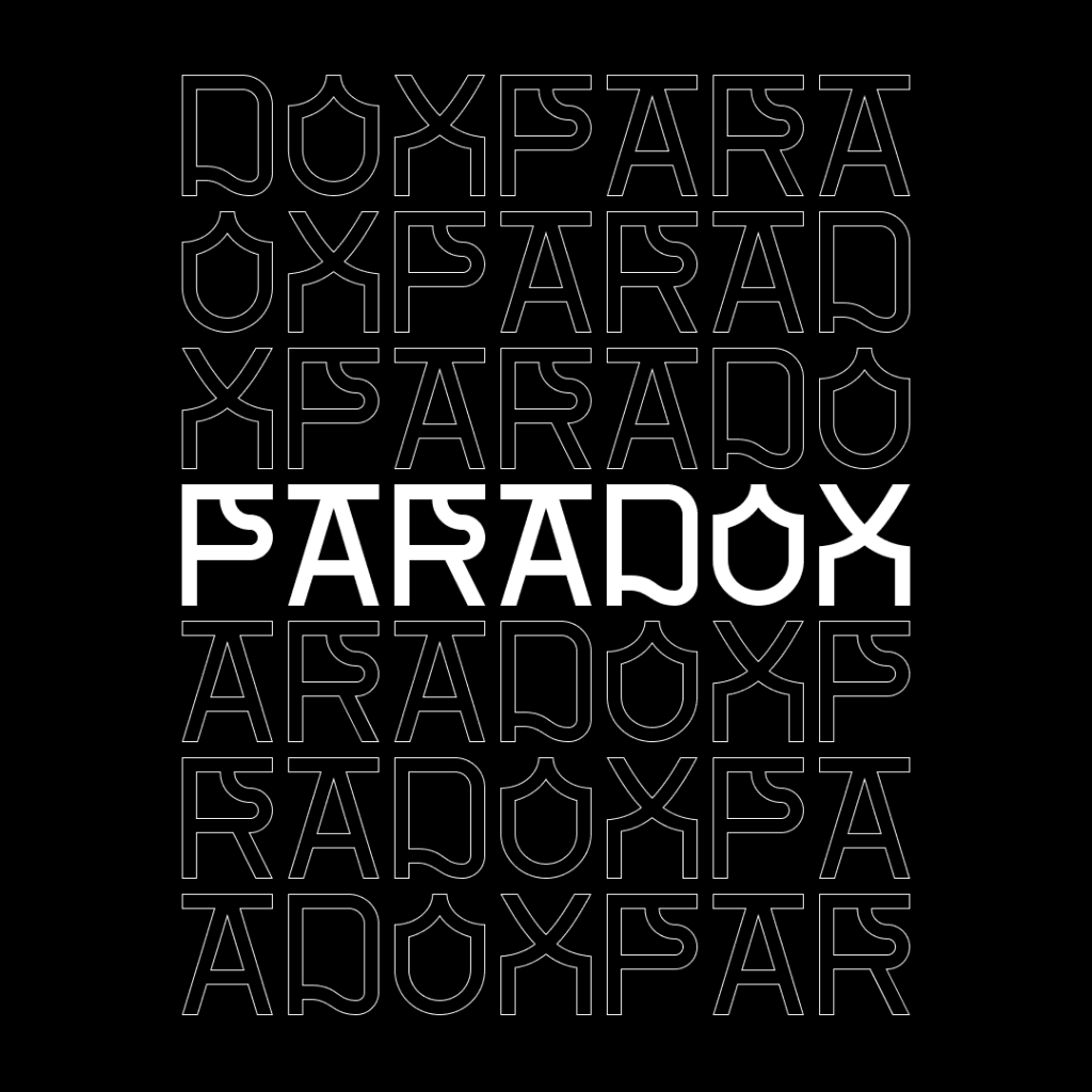
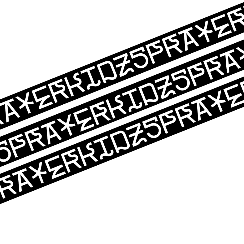
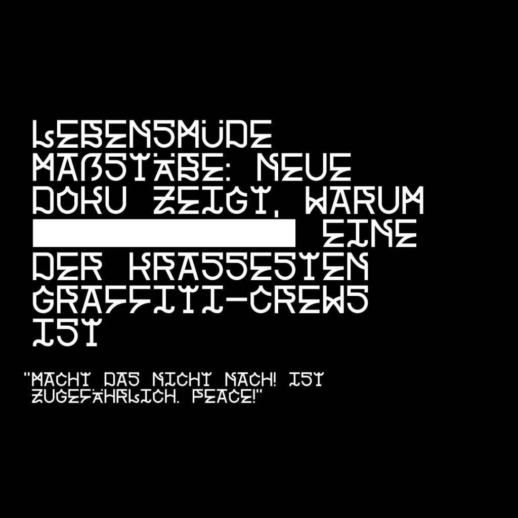
Paradox – A wild yet structured sans-serif, inspired by the graffiti letterforms of Berlin Kidz, a well-known sprayer crew. I designed it at a turning point—when I was fully recovered and ready to embrace creativity again, just before starting my MBA.
For me, type design isn’t about commercialization—it’s about clearing my mind. Each font represents a moment, a transition, a challenge. Seeing them in use—especially in my hometown—is an added bonus I deeply appreciate.
If you’re interested in using any of my fonts, I’d love to see where they go next.